UX design is becoming a common practice in almost every field. Biomedical software, with its complex nature, is the ideal place to adopt some good UX practices! Current solutions have various shortcomings. In this blog, we explain how good UX practices can significantly improve and speed up the interrogation of biomedical data. We illustrate the above with a real-life example from our latest development: the Antibody Discovery Module.
UX design in a nutshell
As software leaves the hands of engineers and is adopted by a more general audience with a less technical background, the need for clear, understandable interactions and interfaces grows. The complexity users have to deal with increases with the ever-growing amounts of data that can be generated – a direct result of technological advances and increasing computational power.
User Experience (UX) design is a way of thinking, planning, and specifying products. The purpose of UX design is to fulfill the users’ needs[1] and to provide a holistic experience with the product or service. This type of design can be applied to a variety of services and different products. In software development, UX does not only involve the user interface (UI) and visual part of a product, but also the information hierarchy, the design of the flows, and the overall “experience”. Good UX design integrates excellent knowledge of the people who are using the software and considers all the relevant aspects of a product: from the smallest interaction to the general context (physical and virtual) of the user.
The problem with present-day biomedical software
The computational toolbox with which we can interrogate biomedical data is ever-expanding. However, the extent to which platforms and analysis pipelines take user experience into account is very limited. By performing a heuristic analysis of several informatics solutions in the field of immunomics, we were able to identify the main shortcomings in usability of present-day biomedical software.
It’s unnecessarily complex – Many factors make software complicated, and most of them can be traced back to the way the software is built. For example, when new functionality is added, it is often implemented using an array of endless buttons, sliding menus, and options, without taking into account the solution, in its entirety, to understand which functionalities are truly necessary. This leads to overly complex layouts – a consequence of products designed by software engineers. This results in products that are computationally sound but have unorganized interfaces and are difficult to comprehend for users. In turn, this leads to lots of time spent on onboarding new users, a frustrating user experience, and – at its worst – mistakes, which can lead to loss of time and money.
It’s not visually standardized – While customization can be a powerful resource that can greatly improve user experience, the lack of familiar interfaces, and clear, understandable workflows add to the complexity and confusion. Consequently, there are specialized tools that suffer from poor integration in wider workflows due to their extreme customization. As a result, we find a field with ever-changing software and technical requirements, lots of time in onboarding for new tools, and the necessity to have several tools to have a complete workflow.
It’s not built for researchers – Scientific software often evolves from command-line tools built by doctoral candidates or bioinformaticians aimed at solving niche problems. For these tools, little consideration is given to their ease of use; rather they are focused on accomplishing very specific tasks. The main consequence is that these tools use a form of interaction that their users are not familiar with – for example, the command line. Moreover, they use complex jargon that is not suited to the level of expertise of an average user. This steep learning curve usually has a big impact on their workflow and their experience with the software.
It’s not validated! – The concept of (user) testing software is not common practice for most scientific software developed by, or spun-off from, academia. As a result, users end up having an unpleasant experience with the software. Importantly, little consideration is given to support users that require extended accessibility. This leads to a product that does not fit the needs of the users, forcing them to change their workflow to fulfill a specific task or need.
UX to the rescue!
During the development of specialized and niche software, often the focus is on providing computationally efficient and accurate software, in detriment to other aspects of the product, such as the overall experience. The core of the problem is that tools – including their user interface – are often created from a back-end perspective, without proper consideration of the users’ needs, context, and workflow. This means that software developers are forcing users to change how they think and work, adding complexity and steps to the user’s workflow. To prevent creating new pain points for users, good development practice puts the user experience first.
How does UX design help out?
Learn from your peers and standardize – Good UX design is data driven. “Best practices” in UX are created based on continuous research and testing, providing a set of UX patterns or UI “templates” that are proven to work. Furthermore, the more standardized an interface, the easier it will be recognized by users. In turn, this means the learning curve of using software will be smaller and faster to overcome. This is extremely valuable in a field where, due to its complexity, the implementation of new software usually leads to lengthy and costly onboarding periods. Making the software more intuitive means users spend less time in training, and they can start taking full advantage of the software sooner.
Empathize with the user: consider the bigger picture – UX design is heavily based on the user’s context, which is mostly discovered through research. UX design is not only about creating beautiful interfaces that use the best practices, but also getting to the core of the problem. In this process, it’s key to empathize and research! UX research can play a big role when developing a niche, specialized software. Researching the user’s flow, especially using qualitative research methods such as user interviews, allows product developers to get a comprehensive view of the user’s workflow and develop a solution that simplifies their life, rather than adding additional complexity.
Test! Test! Test! – Crucial data is collected during the testing phase, where prototypes of new functionality are validated with prospective users. The information gathered during testing feeds back into the design of new iterations of prototypes until not only the specific problem the user faces is solved, but the approach taken also fits the user completely. This includes suiting the user’s workflow, specific requirements, and needs such as using the right vocabulary, removing redundancies in the workflow, and translating computational needs into easy-to-use interfaces.
A real-life example: IGX-Cluster
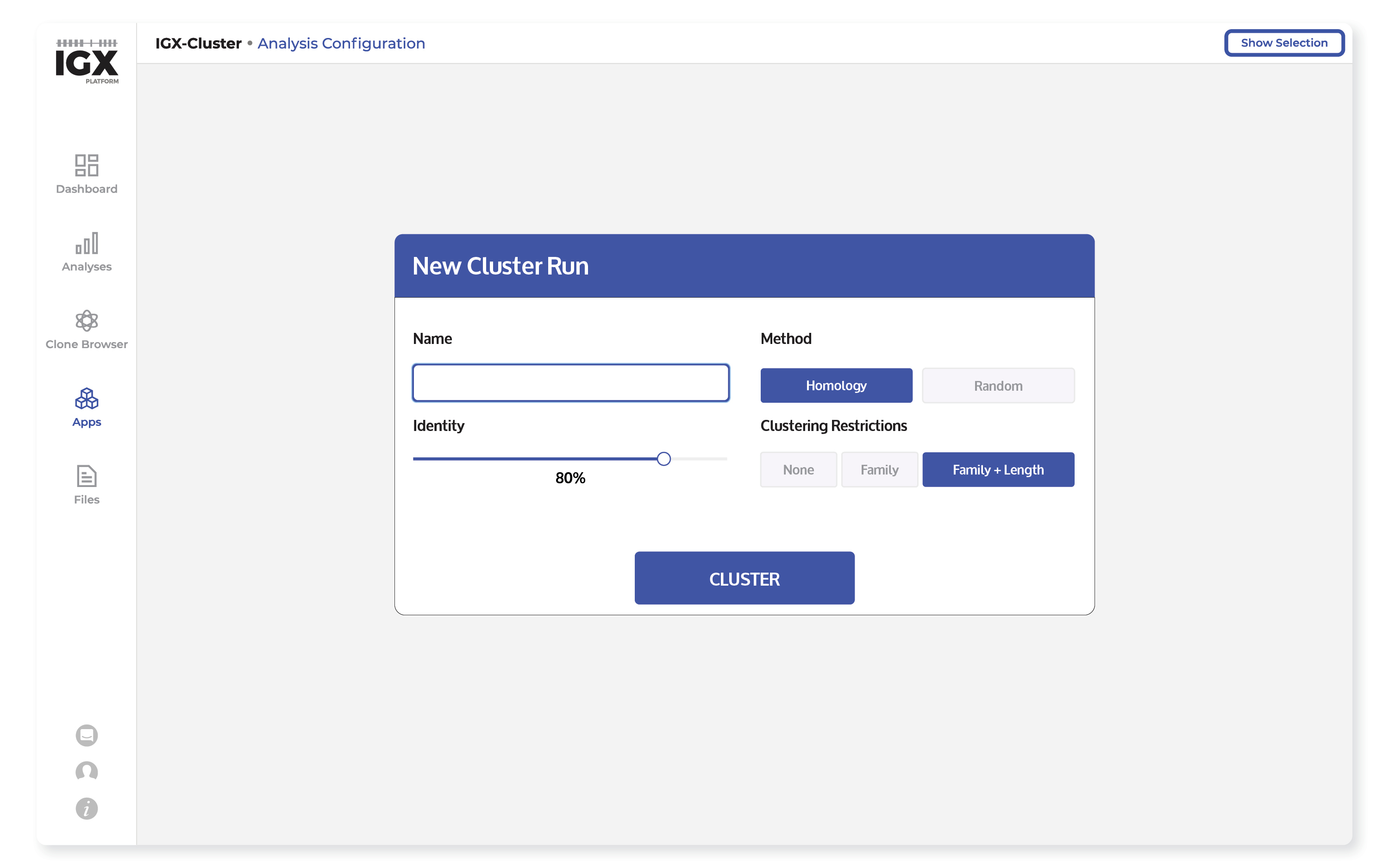
To illustrate how UX design has played a crucial role in the development of the IGX Platform, let’s take a look at IGX-Cluster. This IGX App allows scientists in the field of antibody discovery to configure a clustering run, the results of which can later be visualized in a phylogenetic tree. In early stages of prototyping, the development team created an interface to test and gather feedback from users (Figure 1).

- This first iteration of the interface is not visually standardized. For “Method” and “Clustering restrictions”, the controls are switches (also known as toggles), which only allow users to select a single option. Visually, this design is confusing, as the switches look like buttons, giving the impression that multiple options can be pressed and thereby selected..
- This lacks resemblance to the rest of the platform. The disorganized layout adds more complexity to what should have been a straightforward configuration page.
- Finally – and perhaps most importantly – it is not validated. Terms such as “Identity”, “Homology” and “Family” were found not to be precise after user testing and could have led to a misunderstanding.
As is likely clear by now, this interface did not take cues from the UX design principles mentioned above.
Designing with UX in mind
From our learnings during the user research and testing phase, we improved the IGX-Cluster in several ways:
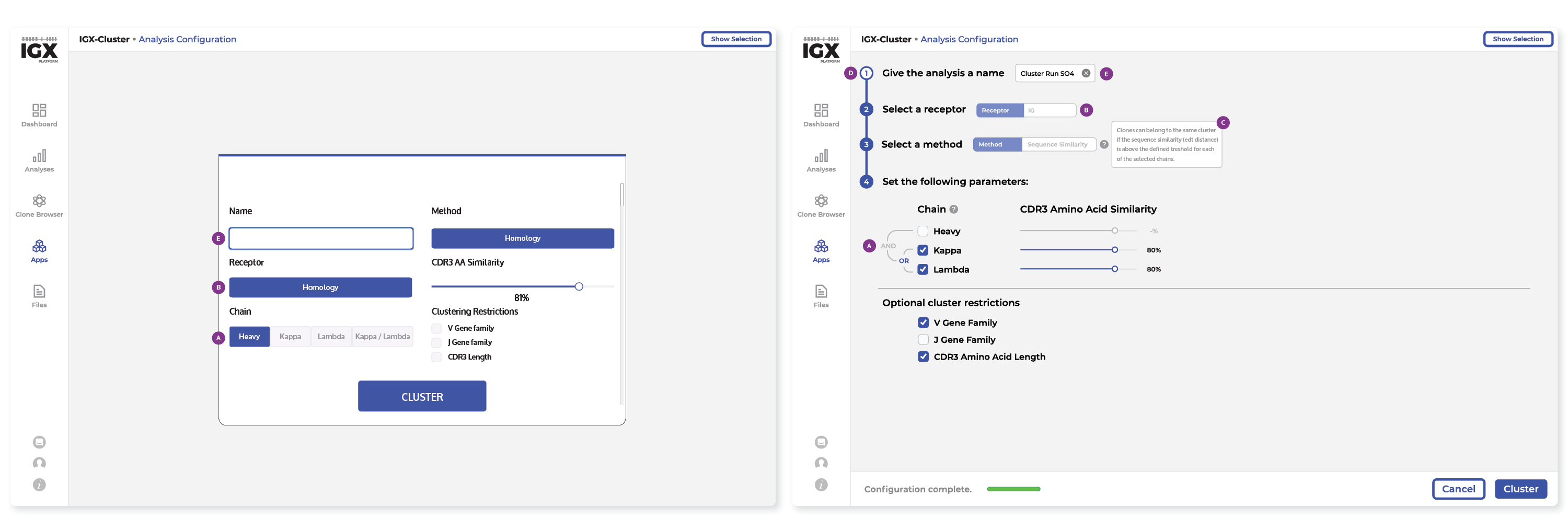
- Standardization, also within the platform. We decided to use standardized elements, such as checkboxes (indicated by tag A in Figure 2), steppers, and sliders, that are easy to recognize. Furthermore, to maintain consistency, we use specific tag elements (indicated by tag B) that are common throughout the platform.
- Transparency for users. We’ve added explanations that pop up on hover (C), as well as a clear workflow emphasized by the steppers (D). This allows users of different levels of expertise to navigate and complete the configuration, while providing information on how they are doing. This was key learning we encountered through UX research: our users want to know how the analysis methods work.
- Based on testing, we also decided to increase the verbosity to provide further guidance throughout the app and platform (“Give the analysis a name” instead of “Name”, see tag E in Figure 2).

Figure 2. IGX-Cluster before, and after user research and testing, with relevant changes indicated in purple. Changes C and D have no equivalent state in the initial interface implementation.
Benefits of implementing UX in biomedical software
All the above-mentioned design decisions – as well as many others that are not reflected here – were based on a myriad of interviews with researchers from different backgrounds and levels of expertise and were obtained throughout the design and development process. By sourcing from a variety of prospective users at different phases during development, we ensure that we take into account the background and context of all types of users. This development paradigm yields several important benefits:
Save time – Easy to understand workflows and a clear interface allow for faster iteration and task completion. Good UX makes the onboarding more efficient by reducing workflow complexity and speeding up the learning phase.
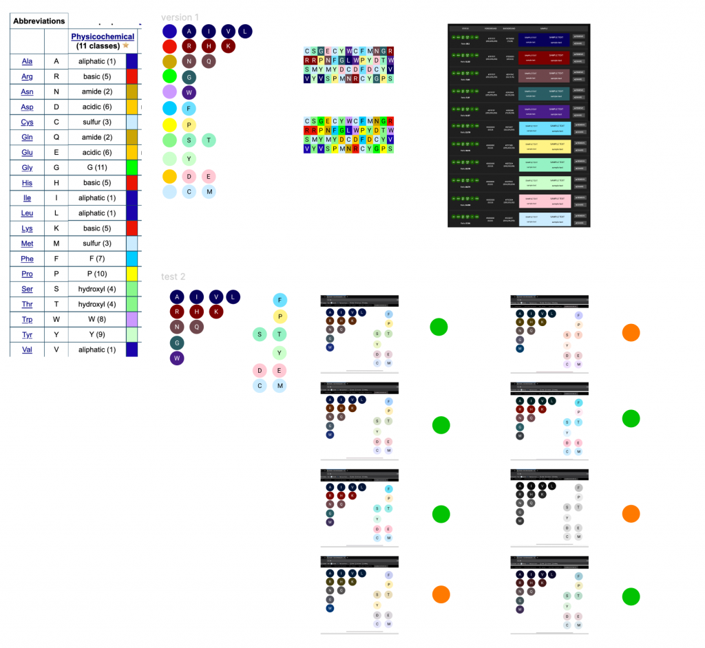
Improve visuals – Sequencing (meta)data are complex and intertwined, so it is important to present these data in a comprehensible way. Visualizations with clear visual and informational hierarchy are easy to read and to communicate to third parties. Researchers deal with complex and intertwined data layers, so it is important that the tools ensure data is as comprehensible and as easy to read as possible. This also reduces the margin of mistake when interpreting visuals: you no longer have to discern between 15 shades of blue to find your valuable data. Importantly, accessibility is often forgotten; UX-focused design ensures people of all abilities can use the software (See Figure 3).
Keep the focus on the research – By providing user-friendly tools that solve complex problems, users no longer need to spend time learning to code, trying to figure out niche vocabulary, or waiting for bioinformaticians to build pipelines. Moreover, an intuitive user experience ensures users of all skill levels can get the most from the software. By putting researchers in control of their own analysis, they can answer their questions by directly applying their knowledge. This prevents the information from getting lost in translation from the biological question a researcher has, to the computational solution a bioinformatician should develop.

Good UX = good software
In conclusion, UX design provides another perspective on creating products that focus on users’ needs. Incorporating UX into the process of biomedical software development is greatly beneficial for users, as it can reduce learning curves, improve performance, and create better products that fit users’ workflow. Using tools that consider users’ experience is full of potential – for both users and companies. While the field is still blooming, now is the right time to incorporate all the knowledge and practices that UX design can offer into biomedical and research software!
Would you like to see our intuitive immune repertoire sequencing data analysis software in action? Contact us to schedule a live demo!
Bibliography
- Norman, Nielsen. The Definition of User Experience (UX). Norman and Nielsen Group. Retrieved from https://www.nngroup.com/articles/definition-user-experience/ March 2021
- Interaction Design Foundation. User Experience (UX) Design. Retrieved from https://www.interaction-design.org/literature/topics/ux-design March 2021
- Interaction Design Foundation. User Research. Retrieved from https://www.interaction-design.org/literature/topics/user-research March 2021
 | Carla Jéminez PérezUser Experience DesignerAs a User Experience Designer at ENPICOM, Carla focuses on research and design to create products that are user-centered. Carla specializes in analyzing complex workflows and finding ways to improve, simplify, and implement them in a way that is easy to use and meets all users’ needs. |